UpUp
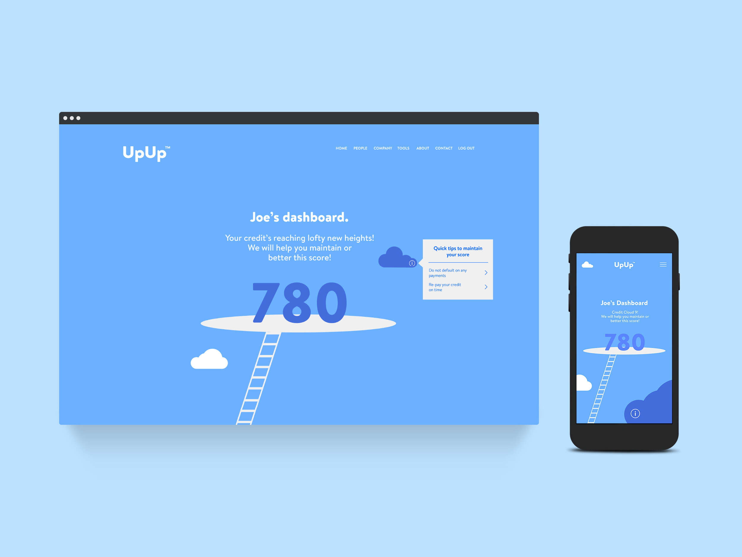
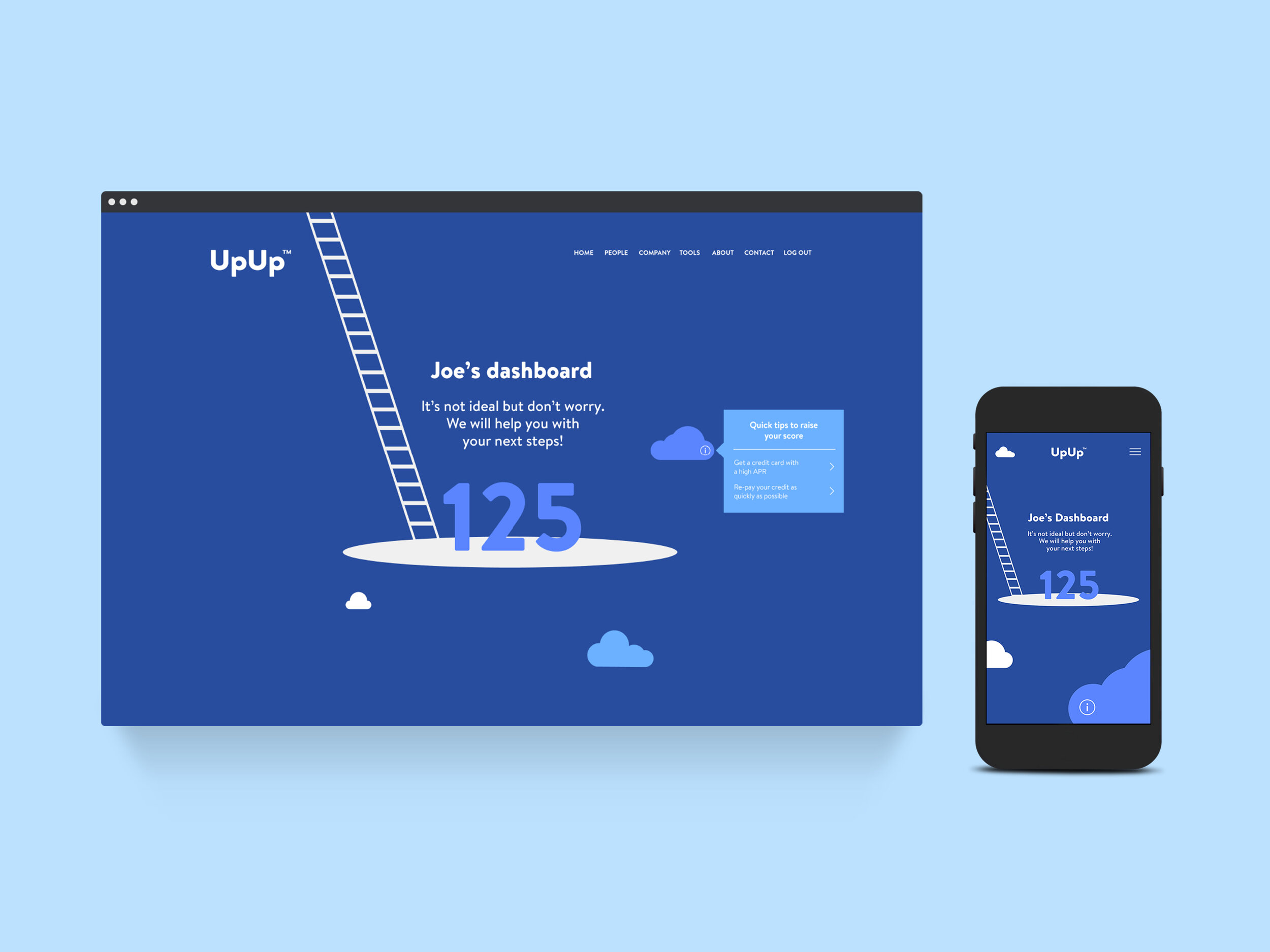
Credit card company UpUp (formerly AQUA) were in need of a brand refresh. Being a credit-building credit card company, UpUp looked to move away from the alienating and complicated language of credit, in favour of creating a more accessible experience. The brand concept of “stepping up credit”, lent itself to a bright visual territory of clouds and ladders, aiming to make for a slightly more consumer friendly and engaging brand.
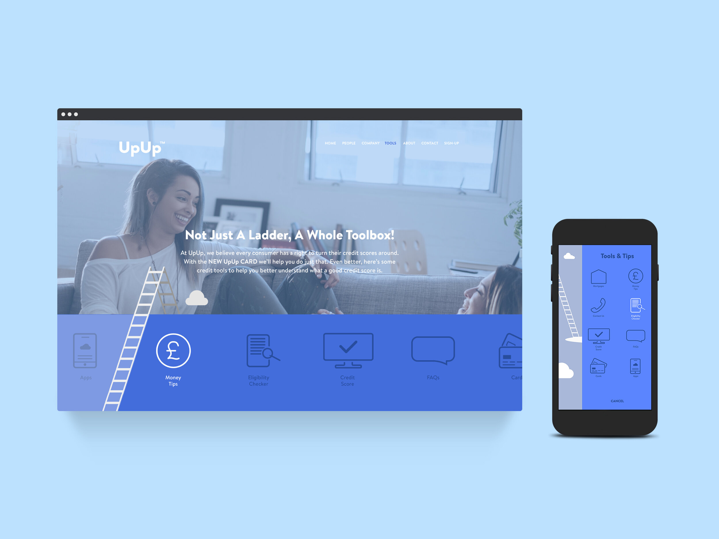
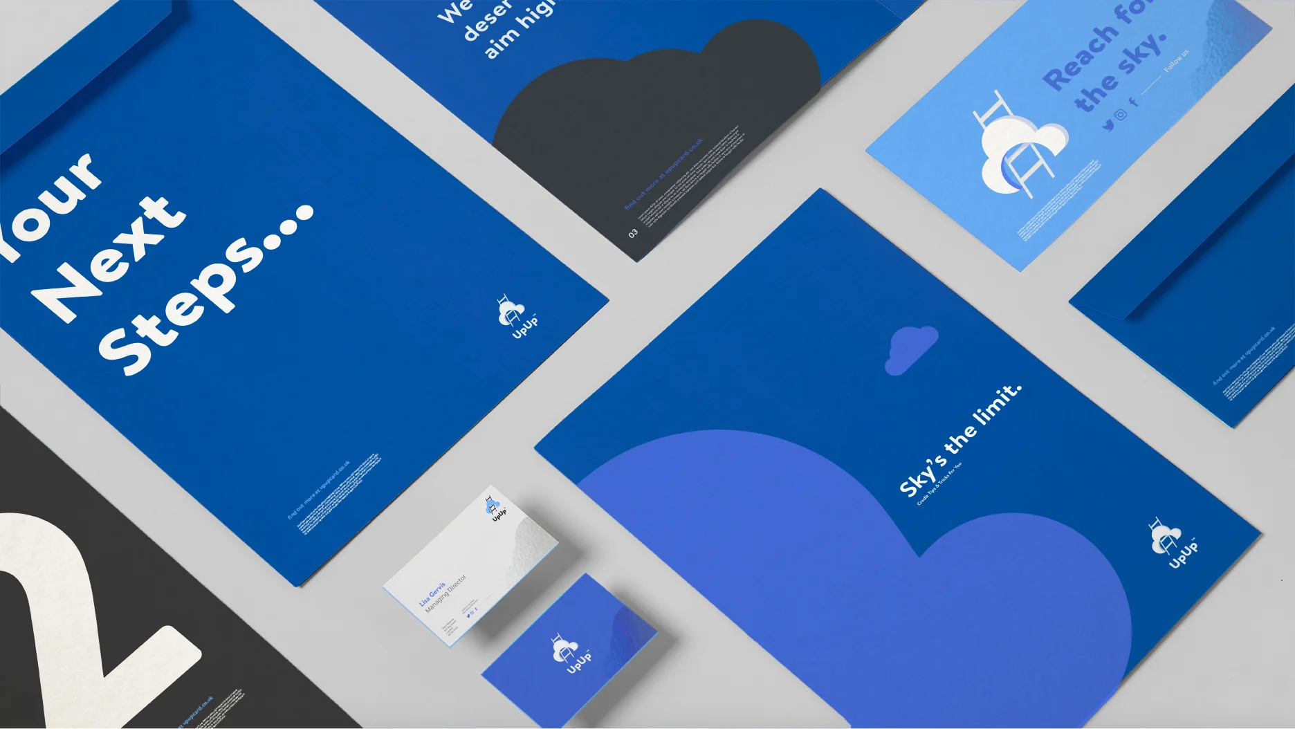
The UpUp ladder is used as a means to achieve your new credit goals and acts as a notion of constantly improving upon your previous credit score. With aspiration playing another large part to the core brand, clouds seemed another fitting visual to incorporate.
The visual approach was 2d vectorised, to keep things happy and simple. By providing a variety of cloud shapes, these could be used in flexible ways to show off the brand; be it through image placeholders, textural patterns or minimal decor, a solution in which the brand could be replicated consistently.
Tone of voice, was very much inspired by this brand-world of clouds and ladders; light, fluffy and joyous as a way of making this credit service a little more personable to the everyday consumer.